
Decreasing the Distance to Data
By putting live data in text at the top of the page, we matched our work on COVID-19 vaccinations to the readers' expectations.
By putting live data in text at the top of the page, we matched our work on COVID-19 vaccinations to the readers' expectations.
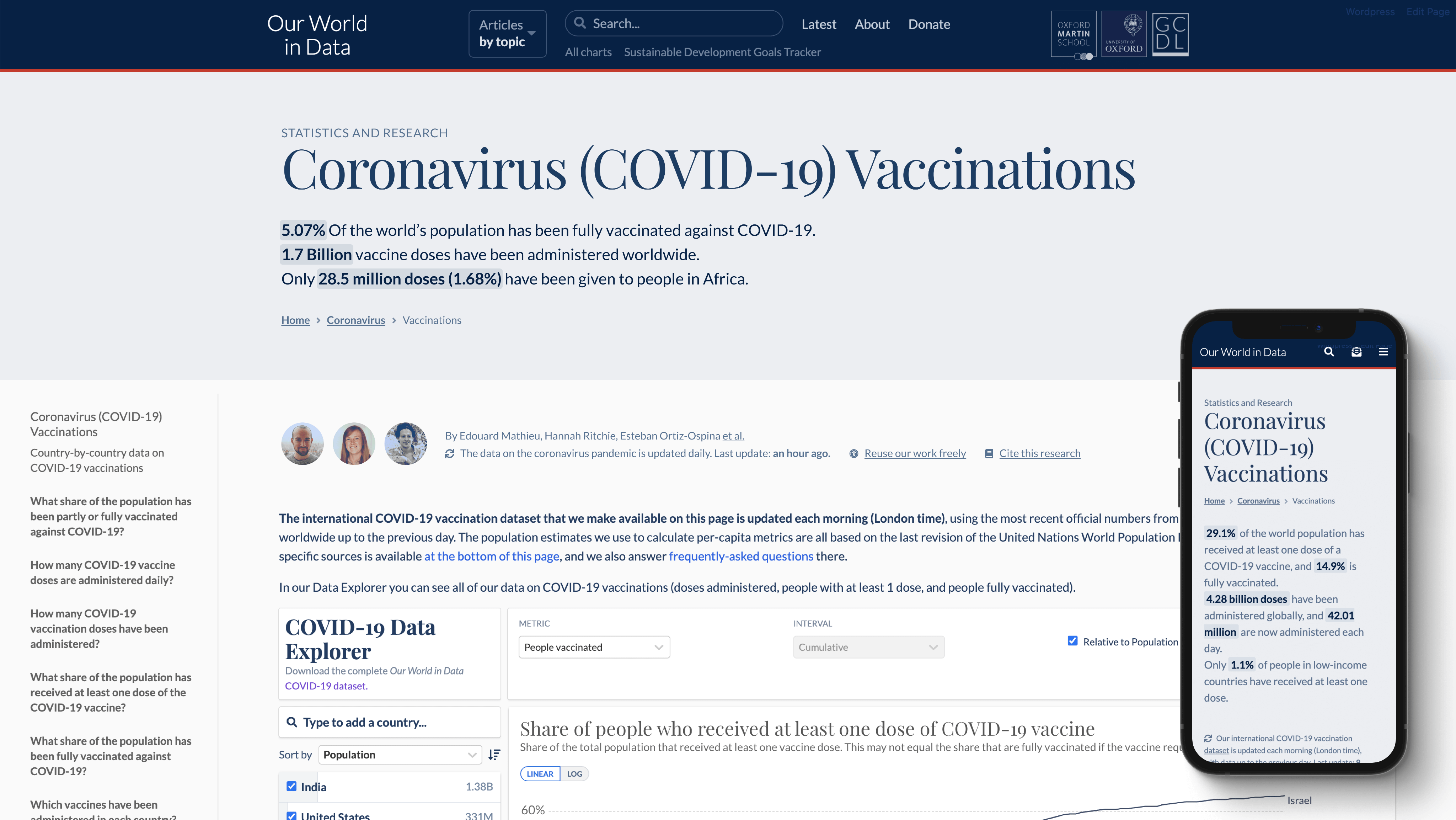
Our page on COVID-19 vaccinations was getting long. There were a lot of elements we thought were important, and moving them to the top of the page and/or emphasizing them were the main two ways to reflect that importance. But if everything's important, nothing is. On desktop, no actual data was visible without scrolling. On mobile, the distance to data was more than two screens. It was time for some adjustments.
User interviews and usability testing confirmed that—especially for COVID-related pages—users expected to see data more quickly, and for a lot of them, anything else was getting in the way.
A few examples to illustrate the main pain points:
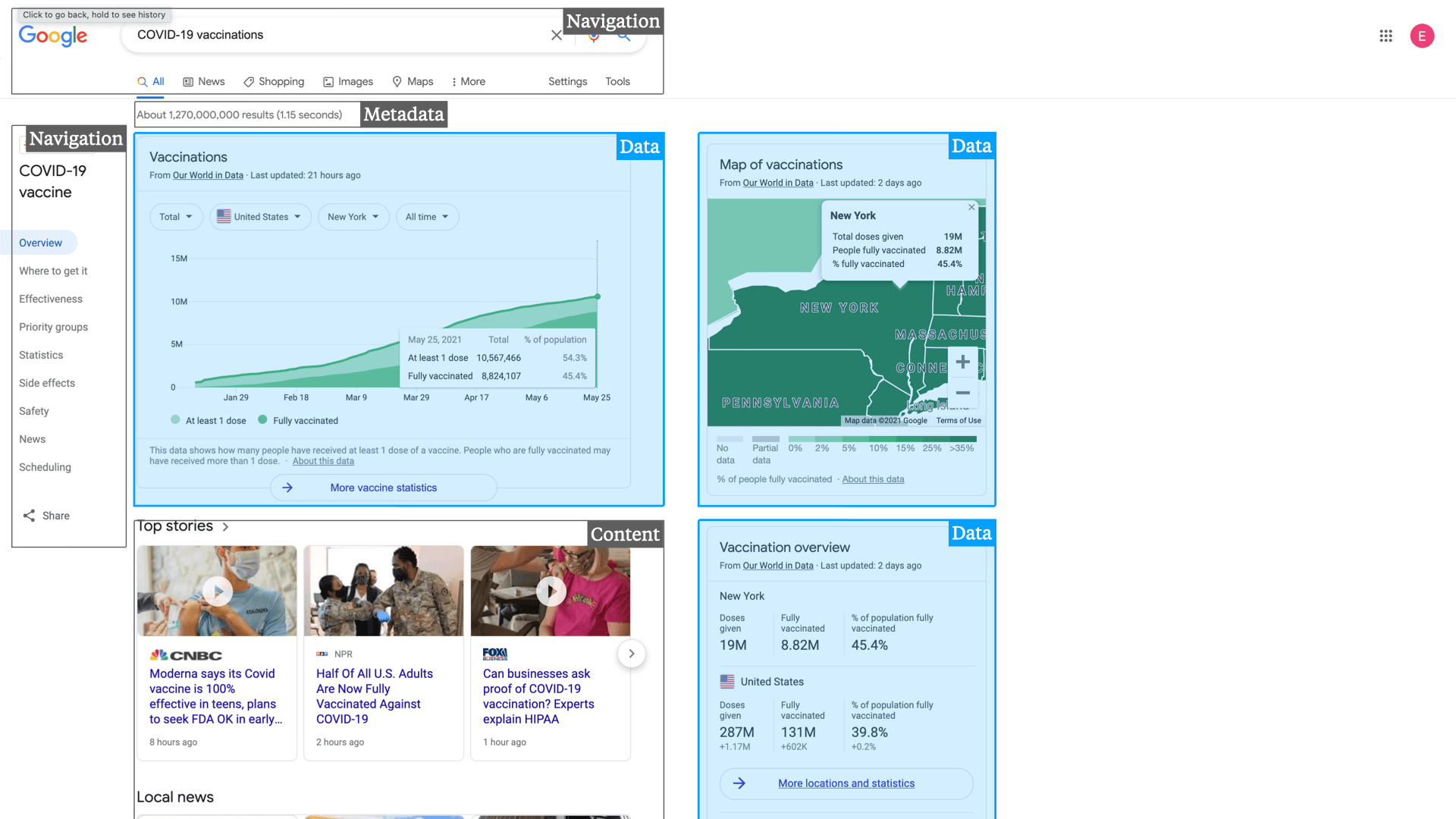
We lost this user to Google, because he just wanted a quick update, and Google did a better job at that. The Google search results page for COVID-19 vaccinations puts data front and center. There's some space reserved for navigation, and a fraction of the screen is taken up by metadata.

“That's where I started [at Our World in Data], you know a year ago, and then I was seeing a lot of very detailed information, and mostly what I was interested in was just tracking the number of detected cases and fatalities for certain regions over time.
Google has a very, you know you just get there very easily. That gives me that first order of information if you will.”
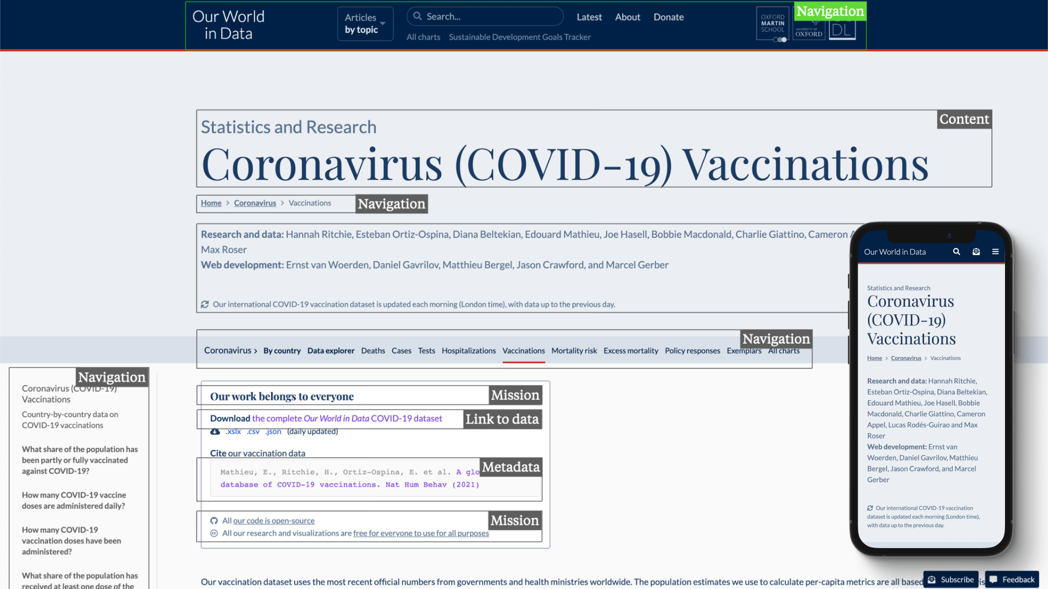
This is Steve Krug's classic almost to a tee. This strategy director really felt we were too text-heavy and didn't get into the meat quickly enough.
And he made a good point: we had navigation (arguably necessary), metadata, our mission, a link to our dataset, but no actual data or research on a 1920x1080px screen resolution.

“I noticed you also did something like this for covid, and then I got used to it and it was ok, but looking at this for the first time, you're just making me work too much and it's too many words.”
“I think right now I trust you guys, that you did that [vetting data and sources] so I don't need to know much about it. So I'm looking forward to more insights and less text. Make me work less, for what I'm learning.”
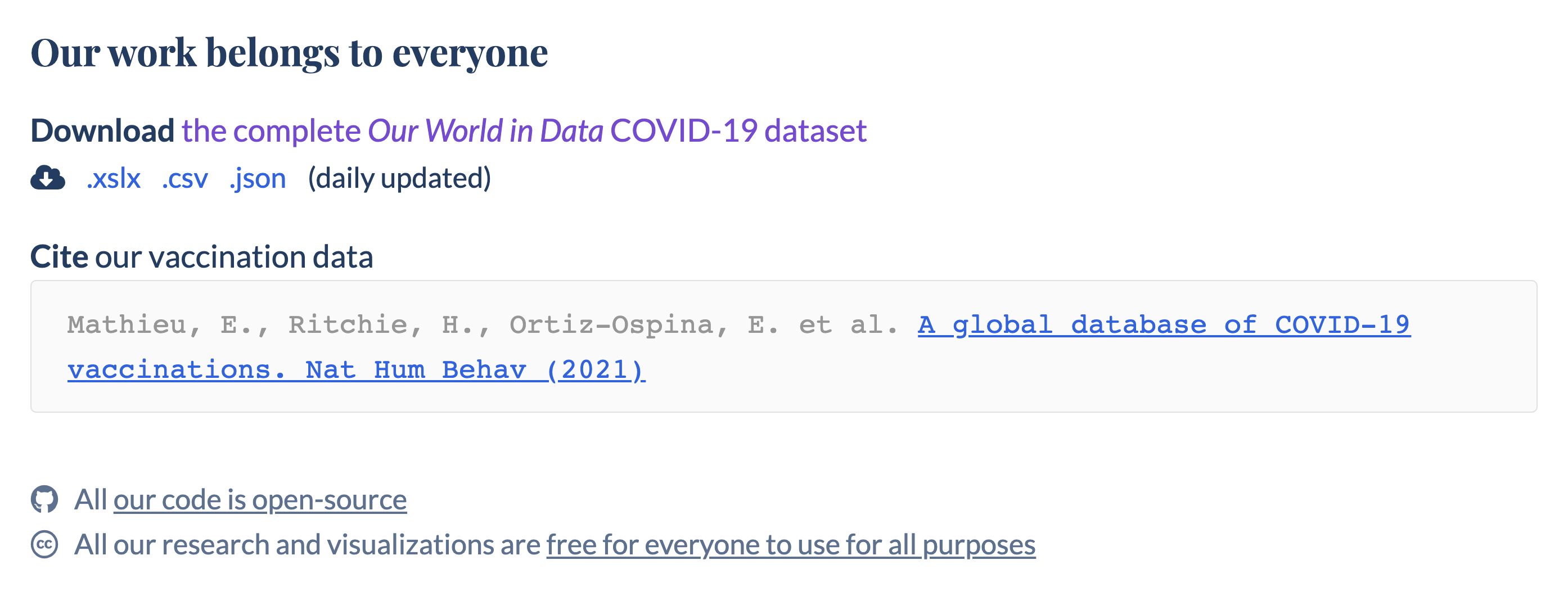
This consultant in magazine publishing acknowledged that sometimes, a link to source data for him to explore was exactly what he wants, but his primary use for our work was “read this quickly”.

“There are times when I'm like oh my god this is great, I wanna play around with this all day, and there are other times where I'm like, I just want to read this quickly.”
Academic researchers are much more used to reading detailed texts; but even for them, it's hard to imagine that having a quick overview (or abstract, if you will) of what's to come wouldn't be helpful, or expected.

“The amount of information, it was thorough, but not too long, not too complicated, it gave a good overview without being too detailed.”
“Then when I read the text and there is reference to the charts I will start looking at the charts.”
“I will usually use some time to maneuver a little around the pages when I look at them, and then I usually do find what I want. Maybe not in the first try, but relatively easy.”
The need for up-to-date data in our text was clear. We had been dreaming about using live data in our writing, but that was technically challenging to get right. Consider the following sentence:
In 2000, the UK emitted 2.45 tons of coal per capita.
When the underlying data changes, we could automatically update this to:
In 2010, the UK emitted 1.86 tons of coal per capita.
Now imagine we add some context, for example: In 2000, the UK emitted 2.45 tons of coal per capita—0.59 tons more than China.
Our automatic update becomes tricky when China's emissions surpass those of the UK in 2004; a phrase like that's very close to China makes more sense for 2003, and after that it should be less than China.
And since (global) progress is all about change over time, not being able to add this contextual layer to the writing would in many cases only be a partial solution for our authors. Big problems require a long-term view, looking at changes over years, decades, sometimes centuries, and organizations publishing data on these problems often do so only once a year.
From December 1, 2020 to July 31, 2021, 64% of people that visited our page on COVID-19 vaccinations were returning users. In the same period, the percentage of returning users was 53% sitewide. Pre-pandemic—in 2019—that number sat at 29%.
A much more active audience and a dataset that was updated daily made it appealing to go ahead with a form of live data in text. And we had proof that for active, returning visitors, not having to scroll down a page or two before getting to the meat, was important.
Based on the insights from user research and the data on returning visitors, I decided to put a few key stats on vaccinations right below the page title. That was a quick way that didn't require any dev effort; just some inline CSS to style the numbers to give them some extra attention, and a daily manual update for the time being.
I also moved the “Our work belongs to everyone” block down below the data explorer.
This then brought the data explorer in view on desktop, and at the very least, surfaced the key stats at the top of the page on mobile. In the end, having the authors' names prominently at the top was not as important as I had thought, and we just moved them to the bottom of the page.
Changes we hoped to see were: an increase in return visits to the vaccinations page, more interaction with the data explorer since it was now closer to the top of the page, no negative user feedback about moving the 'our work belongs to everyone block', and no significant decrease in dataset downloads.
Changes we actually saw:
This was enough for us to move forward and implement a first version with automated live data at the top of the vaccinations page.
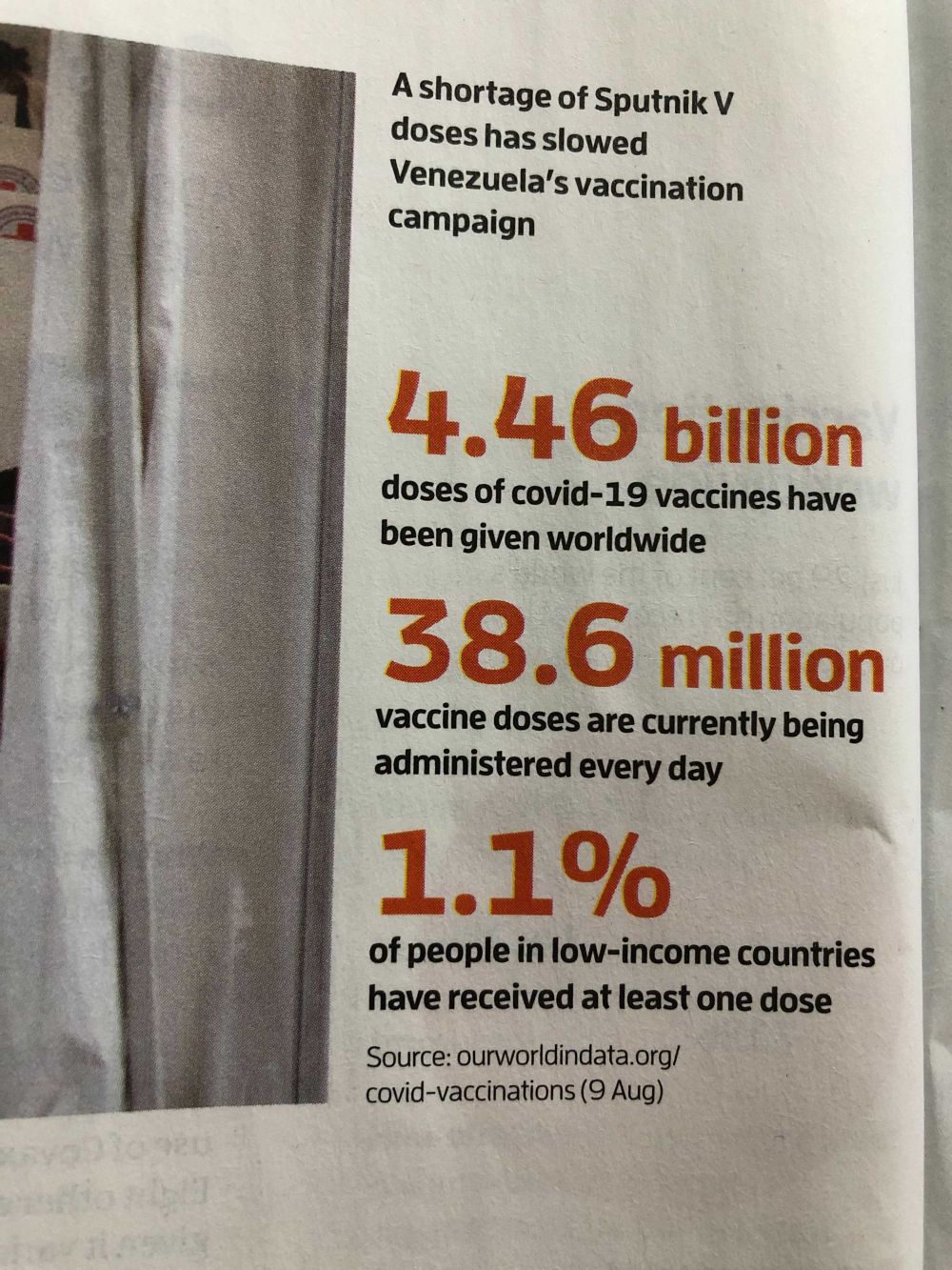
It was also nice to see the New Scientist take three key numbers and use them in one of their print issues:
Underappreciated in dataviz: Well-crafted text, highlighting the key numbers. High information density, high accessibility, often the best intro to a complex dashboard.
— David Bauer (@davidbauer) July 22, 2021
* https://t.co/Pl8fumxelt
* https://t.co/aAnMricqdX pic.twitter.com/0yosnRm9lf
Ultimately, the goal behind these changes is to get data closer to everyone who's interested in it. Especially to people who can use it to make decisions that affect real, long-term progress. Next steps to achieve this goal include:
These data points at the top of the vaccinations page come directly from our datasets. Now that we can use "live" data in our writing as well as in our charts, we can connect those two in many new and hopefully useful ways. An example: pic.twitter.com/e2eJA3gjGO
— Ernst (@erniedesigns) June 25, 2021